

A high-end, digital invitation brand selling bespoke
e-invitations via Etsy.
My Role: Digital design, brand identity, e-commerce experience
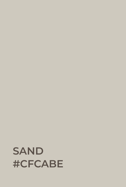
Colour palette
The colour palette conveys sophistication, quality, and a sense of grounded luxury. The soft, earthy tones evoke feelings of comfort, authenticity, and elegance, appealing to an audience that values high-end, bespoke experiences.
Sand sets a welcoming, refined tone, offering a neutral base that feels approachable and inviting.
Rich Taupe and Espresso provide richness and depth, enhancing the sense of luxury and exclusivity. They are strong, grounding colors that evoke a sense of trust and reliability.
Earthy Khaki brings in subtle earthiness, tying the palette to nature while maintaining elegance. This hue also adds a slight vintage feel, balancing the more modern elements in the design.


Typography
Combining Hello Paris Sans & Candara Beauty Script to create a harmonious balance between modernity and classic elegance.
The first offers a clean, contemporary feel, while the script adds a touch of sophistication and personalisation.
Montserrat is used for body text to ensure readability while maintaining a modern aesthetic, complementing the logo fonts effectively.
Brand voice & tone


Timeless
Sophisticated
Luxurious
Refined
Special
Personal
Memorable
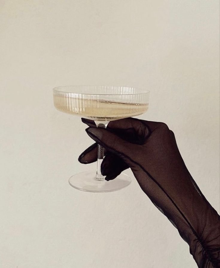
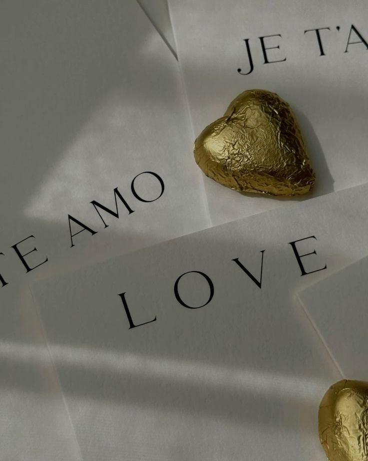
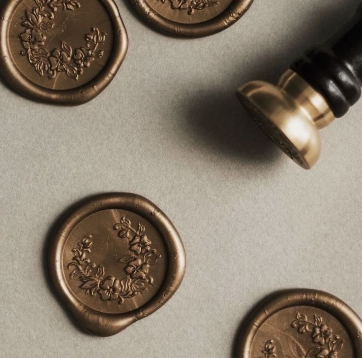
Mood & vision


Logos & iconography
Initial concepts & exploration


User Research & Feedback
To ensure the logo resonated with the target audience, I presented different logo variations to a user group that matched the demographic of those purchasing e-invites. Using a voting system, I gathered insights on which designs best conveyed the brand's identity.
Key findings from the feedback:
Typography: Users overwhelmingly preferred the combination of two fonts—a sophisticated script paired with a clean sans-serif—citing it as both elegant and modern.
Iconography: The feather quill was the most popular visual element, reinforcing a sense of craftsmanship and timelessness. The fountain pen ranked second, while a text-only design was the least favored.
Overall Impression: The most well-received designs felt high-end, refined, and luxurious, aligning perfectly with Invite Only’s brand vision.

Logo refinement based on user feedback.
Primary logo
Usage: Website headers, marketing materials, digital invites, and branded documents.
Purpose: This variation keeps the branding simple and elegant, ensuring easy recognition and adaptability across different platforms.

Secondary logo
Usage: Large-format branding, presentations and promotional materials.
Purpose: This version emphasises the curated and high-end nature of the brand’s collections while adding a touch of artistic sophistication.

Tertiary logo
Usage: Social media profile pictures, favicons, app icons, and watermarking.
Purpose: A recognizable and refined mark for smaller applications where the full text logo may not be necessary.
Tailored Digital Invitations: Collections & Bespoke Designs
Collections
Designed for those seeking effortless elegance, Invite Only’s curated collections feature pre-designed invitations within a cohesive aesthetic.
Each template is carefully crafted with attention to typography, layout, and color, allowing for personalisation of event details and imagery while maintaining a polished, high-end feel.
These designs provide a streamlined yet sophisticated solution, perfect for hosts who want a beautifully designed invitation without the need for a fully custom approach.


Bespoke Designs
For a truly one-of-a-kind experience, Invite Only offers bespoke invitation design, tailored to a specific vision or event theme.
Working from a detailed brief, each custom piece is designed from the ground up, ensuring exclusivity and a perfect alignment with the event’s style.
From intricate illustrations to unique typography pairings, every bespoke design reflects the individuality of the occasion it represents.